Lockups
Alongside the Bildmarke and the wide logo there are two generated lockups. Both extend the existing logo system — the Bildmarke and the wide logo remain valid unchanged.
| Lockup | Construction | Use |
|---|---|---|
| Division lockup | Bildmarke left, "BAUER GROUP" above the division name right | Profit centres and divisions: website headers, app bars, signatures, letterhead |
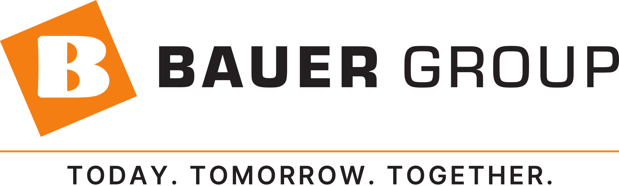
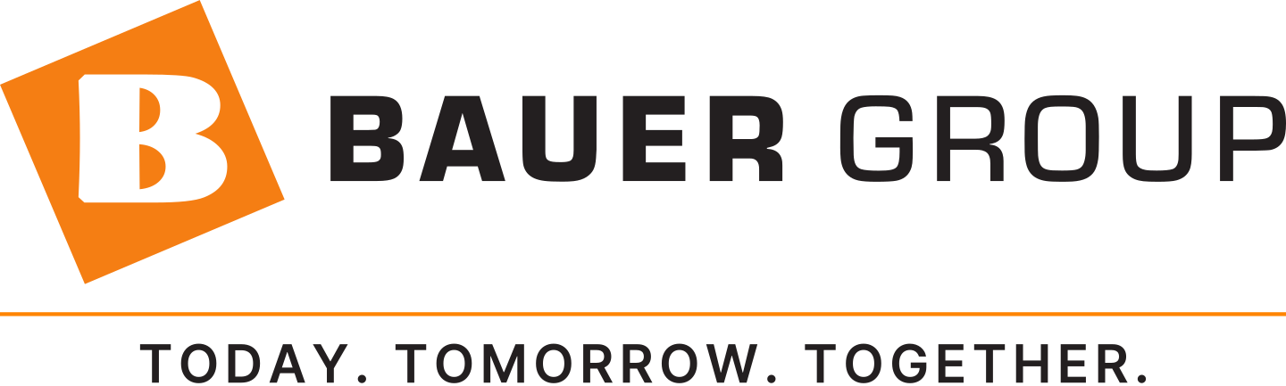
| Tagline lockup | Full wide logo, with a divider rule and a centred tagline below it | Campaigns, title slides, trade fair, advertising, image brochures |
Binding
There are exactly these two lockups. No third line, no combination of the two, no legal form and no location inside a lockup.
Placeholder used throughout this documentation
The construction and measurement figures on this page show the neutral placeholder COMPLIANCE. It exists purely to demonstrate construction and measurements and is not a real division.
The gallery under Assets, by contrast, lists every lockup that is actually generated — there the placeholder sits alongside the real divisions and is labelled as such.
Division lockup


The division lockup is exactly as tall and exactly as wide as the wide logo. Any layout built for the wide logo takes a division lockup without modification.
Measurements
All values are multiples of X — the height of the "B" inside the Bildmarke, as defined in Clearspace & sizes.
| Measurement | X ratio | Units |
|---|---|---|
| Bildmarke height | 2.2176 X | 59.720 |
| Wordmark cap height | 0.6636 X | 17.871 |
| Division line cap height | 0.45 X | 12.118 |
| Bildmarke → text gap | 0.3583 X | 9.649 |
| Baseline 1 → cap line 2 | 0.18 X | 4.847 |
| Baseline distance | 0.63 X | 16.966 |
| Tracking | 0.08 em | — |
Alignment
- The division line is flush left with the wordmark, not with the Bildmarke.
- The two-line text block is optically centred on the "B" of the Bildmarke — not on the centre of the diamond.
- The Bildmarke stays untouched; the wordmark moves up by 8.481 units so the block sits centred.
Why the "B" and not the diamond
In the wide logo the centre of the wordmark sits at 29.116 and the centre of the "B" at 29.117 — identical to within ±0.0015 units. The logo has always aligned to the "B"; the lockup carries that rule over to the two-line block.
Needs trademark sign-off
Centring shifts the wordmark by 8.481 units — 14.2 % of the height — relative to the Bildmarke. No path is altered, but the registered mark's internal geometry is. That belongs with whoever owns the trademark before the lockup goes out.
The alternative is ready: setting compactAlignment in scripts/lockups.json to wordmark-fixed keeps the wordmark exactly where it sits in the wide logo. The two-line block then sits visibly lower and reads as appended — which is why it is not the default.
Length limit
The division line must never be wider than the wordmark (200.559 units). The generator aborts with a clear message otherwise. COMPLIANCE uses 61 % of it.
Colour of the division name
The division line carries Orange 600 #EA6D00 — the same ink on light and on dark, exactly like the Bildmarke, which stays unchanged across both tones.
| Background | Contrast | Assessment |
|---|---|---|
White #FFFFFF | 3.14:1 | Logotype exception |
Warm 100 #F0EDEA | 2.69:1 | Logotype exception |
Warm 900 #231F1C | 5.21:1 | AA ✅ |
Black #000000 | 6.69:1 | AA ✅ |
On light backgrounds the logotype exception applies
On light backgrounds Orange 600 stays below the 4.5:1 that WCAG 2.1 requires for body text. SC 1.4.3 explicitly exempts logotypes: "Text that is part of a logo or brand name has no contrast requirement." The division name is part of the brand, not body text — the exception applies.
It applies to the lockup only. As an interface text colour Orange 600 remains off limits; there Orange 700 is the lightest approved step, see Contrast Checks.
Why not the darker step
At 6.50:1 on white Orange 800 #9A4509 would clear even the AAA threshold, but it is oklch(44 % 0.13 40). Below roughly 50 % lightness orange tips perceptually into brown — plainly visible on less well calibrated screens. A division name that reads brown rather than orange on many devices fails at carrying the brand. Orange 600 holds the colour impression and sits just one step below the primary.
Tagline lockup

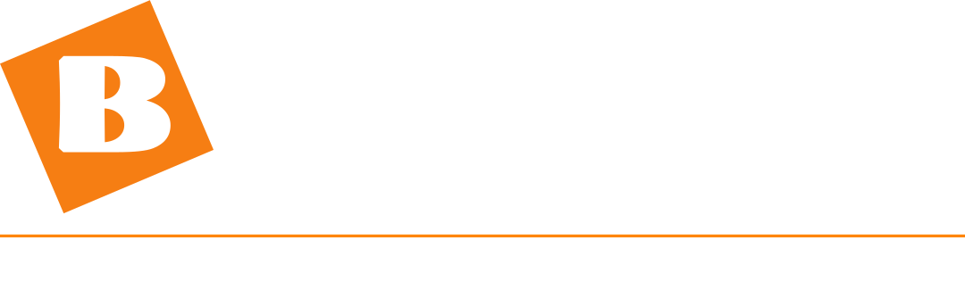
The wide logo stays completely untouched. Below it a thin rule sets the statement off optically, and the tagline is centred on the full width of the lockup.
Measurements
| Measurement | X ratio | Units |
|---|---|---|
| Logo block | unchanged | 269.940 × 59.720 |
| Logo → rule gap | 0.22 X | 5.925 |
| Rule weight | 0.03 X | 0.808 |
| Rule → tagline gap | 0.22 X | 5.925 |
| Tagline cap height | 0.30 X | 8.079 |
| Tracking | 0.10 em | — |
| Total height | 3.0134 X | 81.150 |
Equal gap above and below
At 0.22 X the rule sits symmetrically between the logo and the tagline. It is no closer to either, so it reads as a separation rather than as something appended.
The divider rule
The rule spans the full width of the lockup and carries BAUER Orange #FF8500 — identical in both tones, exactly like the Bildmarke. It is mandatory and may be neither omitted nor recoloured.
That puts it in line with what the brand already does: the email signature runs a 3 px orange line as its primary branding element, and every section heading in this guide carries the same orange underline. A dark rule would have been the only separator in the system without orange.
Its weight is 0.03 X. At 220 px width that renders 0.66 px, at 60 mm 0.18 mm — a hairline. For the documented offset printing that is unproblematic, and the advertising guidelines use hairlines deliberately. It would only become critical in screen or pad printing, where the Bildmarke alone applies anyway.
Why the tagline takes the wordmark's colour
At 0.30 X the tagline is the smallest type in the entire logo system. It therefore gets the highest contrast, not the lowest: it inherits the wordmark's ink, so #231F20 on light and white on dark.
| Background | Wordmark ink #231F20 | Orange 600 #EA6D00 |
|---|---|---|
White #FFFFFF | 16.30 ✅ | 3.14 ❌ |
Grey 50 #FAFAFA | 15.62 ✅ | 3.01 ❌ |
Grey 100 #F4F4F5 | 14.83 ✅ | 2.86 ❌ |
Warm 100 #F0EDEA | 13.98 ✅ | 2.69 ❌ |
The ❌ marks judge Orange 600 as body text — and that is exactly what a tagline is: a sentence, not a mark. For the division name, which is part of the brand name, the same colour falls under the logotype exception.
The generator reads that colour out of the master on every run rather than storing it. The tagline can therefore never drift from the wordmark — not even after the masters are re-exported.
Orange as type stays reserved for the division name
A whole sentence in orange competes with the Bildmarke. As a type colour, orange marks the division name within the lockup system — a name — not a statement.
The divider rule is unaffected: it is neither type nor statement but a decorative accent, which is exactly what Orange 500 is intended for according to the contrast checks.
All taglines
Every tagline in Brand values & mission exists as a finished lockup. All four share exactly the same bounding box (269.940 × 81.150), because the descender of the "Q" is always reserved — which makes them interchangeable without re-tuning a single layout.








Length limit
The tagline must never be wider than the wide logo (269.940 units). The longest current tagline uses 97 % of it — leaving barely any room for another one. The generator aborts rather than running past the edge.
Clearspace & minimum sizes
Exception to the clearspace rule
A lockup is one single piece of artwork, not a logo with an element next to it. Its clearspace of 1 × X is therefore measured from the lockup's bounding box, not from the wide logo's.
The division name and the tagline are the only elements that may ever sit inside the logo's clearspace — and only in the two positions defined here. Everything else stays excluded.
| Lockup | Digital | |
|---|---|---|
| Division lockup | 40 px height | 12 mm height |
| Tagline lockup | 220 px width | 60 mm width |
The division lockup inherits the Bildmarke's minimum size exactly — there is no new number to remember. The tagline lockup needs more, because at 0.30 X its tagline is the smallest type in the system: at 220 px width it stands at 6.6 px cap height, at 60 mm at 1.8 mm.
Below the minimum size
Below these sizes the division name and the tagline become illegible. The existing rule then applies: the Bildmarke alone or the wide logo alone, with no addition.
Assets
Two files per entry, named after the existing scheme:
bauer-group-lockup-<slug>.svg           division, light
bauer-group-lockup-<slug>-white.svg     division, dark
bauer-group-tagline-<slug>.svg          tagline, light
bauer-group-tagline-<slug>-white.svg    tagline, dark
Plus PNGs at 960, 1440 and 2048 px width under /downloads/png/, generated automatically. Every file is rebuilt on every build — none of them live in the repository.








Adding a new entry
Lockups are generated, not drawn. A new division or a new tagline is one line in scripts/lockups.json:
{ "divisions": [{ "slug": "compliance", "name": "Compliance", "nameEn": "Compliance" }],
  "taglines":  [{ "slug": "today-tomorrow-together", "text": "Today. Tomorrow. Together." }] }
Then:
npm run generateThat is all: SVGs, PNGs, previews and download cards on this page and under Downloads follow automatically. The build runs npm run generate before every docs:build anyway — so every deploy carries the complete, current set.
The generator copies the Bildmarke and the wordmark byte for byte out of the masters and verifies that on every run. The added line is converted to outlines from a bundled font — the finished SVGs carry no font dependency at all and open in Illustrator, Canva or InDesign without font substitution.
Never rebuild by hand
Never assemble a lockup manually. If a master deviates, the generator aborts with a clear message — hand-built files have no such safeguard.
Rules
Forbidden
- Never re-typeset the wordmark — lockups come from the generator and nowhere else
- Never set the division name in any colour other than Orange 600 — identical on light and dark
- Never recolour the tagline — it always carries the wordmark's ink
- No divider rule, no frame, no bar between the logo and the tagline
- No third line, no legal form, no location inside a lockup
- Never combine a division name and a tagline — a lockup carries exactly one added line
- Division lockup never below 40 px / 12 mm, tagline lockup never below 220 px / 60 mm
- Never centre the added line — it is always flush left
In addition, all misuses of the base logo continue to apply unchanged.
Known inconsistencies in the existing assets
The documentation quotes #231F1F for "BAUER" and a grey #52525B for "GROUP". In the artwork, however, all ten letter paths carry the same colour #231F20, and the orange in the SVG masters is #F57E13 rather than the token value #FF8500. The lockup adopts the masters unchanged and does not amplify the discrepancy. Cleaning this up is a separate topic.